Maps are windows to our world, offering visual representations of geography that help us navigate, understand, and connect with different places. But the world is a three-dimensional sphere, while maps are inherently two-dimensional. This fundamental disconnect presents a challenge: how can we accurately represent a round object on a flat surface?
This is where map projections come in. These clever mathematical formulas take the Earth’s globe and “project” it onto a flat plane, preserving certain properties at the expense of others. This trade-off lies at the heart of every map projection, and “the worst problem,” as cartographer Bret Drager puts it, “is the distortion of true scales.”

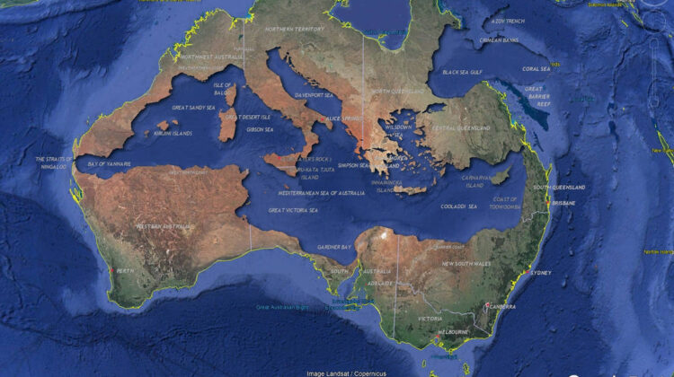
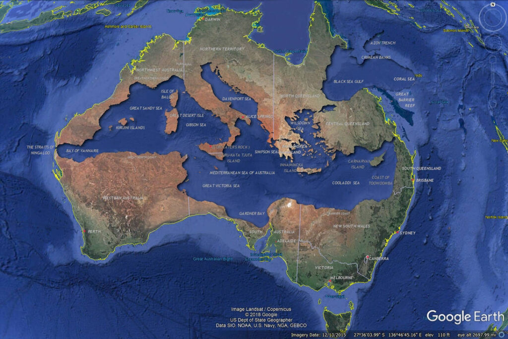
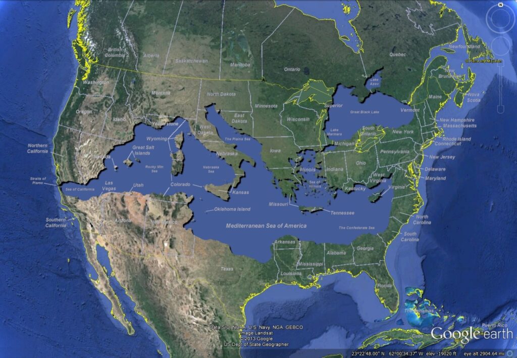
Imagine shrinking the Mediterranean Sea until it fits snugly on top of Australia. This striking image, shared by Drager, beautifully illustrates this distortion. While it allows us to compare the relative sizes of these two regions, it does so at the cost of shrinking and stretching other areas on the map. Greenland appears much larger than it actually is, while Africa seems squashed towards the bottom.
Different projections prioritize different properties. The familiar Mercator projection, for example, preserves directions perfectly, making it ideal for navigation. However, it dramatically exaggerates landmass sizes towards the poles, making Greenland appear several times larger than Africa. Equal-area projections, on the other hand, maintain the relative sizes of landmasses accurately, but distort shapes and distances.

So, is there a perfect map projection? No. Every projection comes with its own unique set of distortions, reflecting the inherent impossibility of perfectly representing a sphere on a plane. Each map is a tool, suited for specific purposes. Understanding these distortions is key to interpreting maps critically and choosing the right projection for the task at hand.
The next time you unfold a map, take a moment to appreciate the ingenuity behind it. Remember, it’s not just a piece of paper; it’s a flattened reflection of our three-dimensional planet, carrying both information and inherent distortions. By understanding these trade-offs, we can use maps as powerful tools for navigating not just geography, but also the complexities of our world.

Leave a Reply