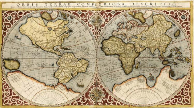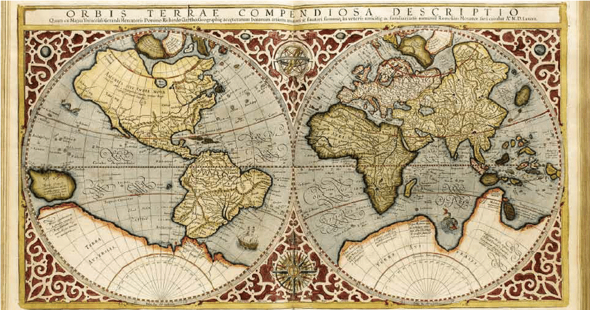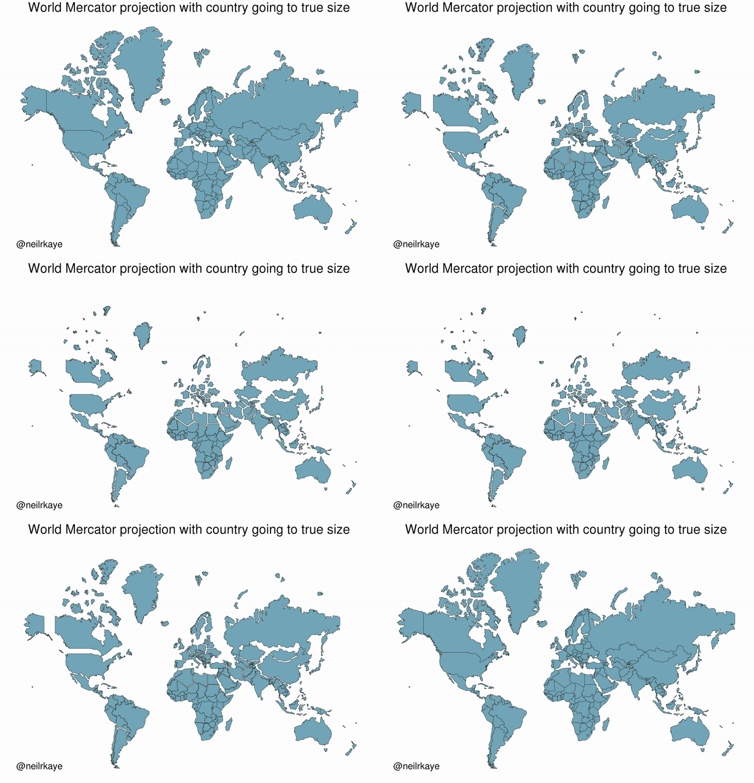
The Mercator map is a well-known and widely used world map projection that has been in use since its creation in 1569. However, it is also known to be a flawed representation of the world due to its distortion of size and distance. While it is useful for navigation, it can give a skewed view of the world that perpetuates certain biases.

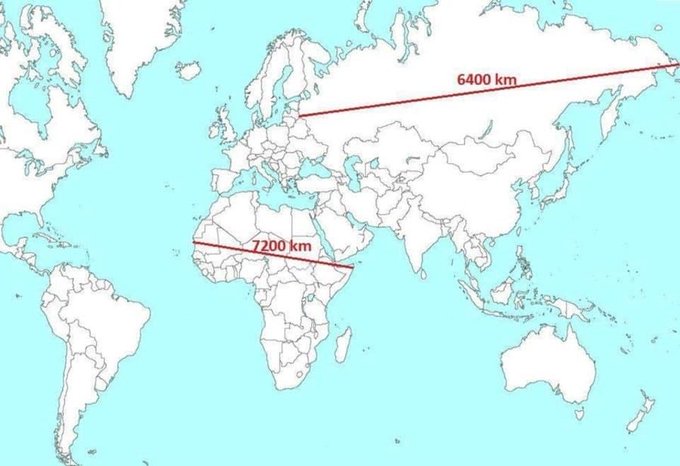
One way to demonstrate this distortion is through the use of a planisphere. This is exactly what you’ll find at the website link provided: a planisphere that illustrates the difference in distance across Africa and Russia. The planisphere shows the distance across Africa to be much shorter than the distance across Russia, which is not accurately represented on the Mercator map.

This is an important issue to be aware of, as the Mercator map can perpetuate the idea that certain countries and regions are more important than others simply because they appear larger on the map. This can lead to biases and misperceptions, particularly when it comes to global politics and economics.
By acknowledging and understanding the distortion inherent in the Mercator map, we can better work to create a more accurate and equitable view of the world. We can also work to seek out alternative map projections that offer a more accurate representation of the world’s geography.

In short, the use of a planisphere to demonstrate the distortion in the Mercator map is a valuable tool in helping people understand the flaws in this widely used map projection. If we want a more accurate and equitable view of the world, it’s important that we acknowledge and address these flaws.

Leave a Reply