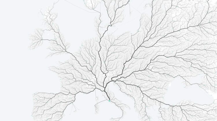
All roads lead to Rome” is a phrase that has been used for centuries to express the idea that there are many different paths to a single destination. In the modern era, this phrase takes on a new meaning as data visualization techniques allow us to examine the actual paths that people take to reach Rome. The “Roads to Rome” project is a stunning example of data visualization that examines mobility patterns on a very large scale.
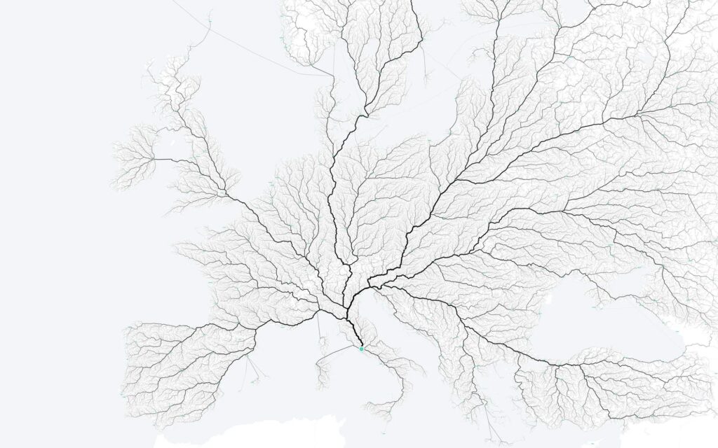
Roads to Rome
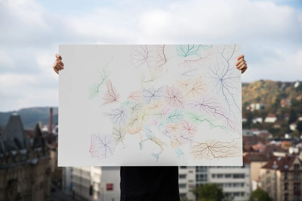
The project uses routing algorithms on existing street infrastructure to create visualizations of over 486,000 routes to Rome. By examining these routes, the project is able to shed light on the ways in which road infrastructure reflects regional, political, and geographical situations. The visualizations produced are both informative and aesthetically pleasing, making them both data art and information visualization.
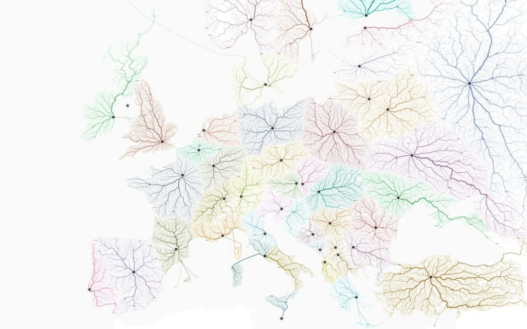
Roads to Rome
The “Roads to Rome” project page provides detailed information, interactive maps, and an “explore” app, as well as media downloads. This allows users to explore the visualizations in depth and gain a better understanding of the complex patterns of human mobility that underlie the phrase “all roads lead to Rome”.
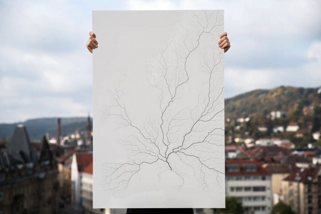
Roads to Rome
One of the most interesting aspects of the project is the way in which it highlights the interconnectedness of the world. The visualizations show that Rome is reachable from virtually any point on the planet, and that there are many different paths that can be taken to get there. This is a testament to the power of modern transportation infrastructure and the ways in which it has transformed our world.
Roads to Rome
Overall, the “Roads to Rome” project is a fascinating exploration of human mobility patterns that offers both aesthetic and informational value. It provides a unique perspective on the phrase “all roads lead to Rome” and the ways in which it reflects the complex web of human connections that make up our world.

Leave a Reply